

A long time ago, back in the early 2000s, the internet looked a lot different than it is today. Youtube and social media was only getting started, and the popular way to share and interactive content online was through this player you would download on the browser called Adobe Flash.
Back then, I worked several co-ops developing games on the Adobe Flash platform and also making games of my own which I would upload to my Yahoo geocities webpage. Now that Adobe Flash has been fully replaced by HTML5, I want start developing games again, but on the HTML5 platform.

In this series, I will document how to develop a game from start to finish using HTML5, JavaScript, and some CSS. The intention is to only use the basics, so all you need is a code editor and an internet browser to start coding. Buckle up!
Getting Started
There are many ways to develop games on the HTML5 platform. You can use a game engine like Godot or Phaser, but I don’t like this approach because it adds extra complexity and overhead, and I want to just keep things simple. After doing some research, I decided the best thing to do is to write the entire game on a single html file. This way it can be loaded directly to the WordPress media library and makes it easy for anyone wants to host the game online.
This is where the CreateJS libraries come in. Built by the people who previously worked with Adobe Flash, CreateJS is a set of modular libraries that make working with the HTML5 canvas a lot easier.
To begin, all we need is a code editor and an internet browser. You can use whatever you’re familiar with; I am using Visual Studio Code as my code editor and Microsoft Edge as my internet browser. Let’s start by creating a folder called helloWorld and create a file inside it called helloWorld.html.
Simple HTML page
Now that we’ve created a helloWorld.html file, it’s time to set up a basic template for our game. Copy the basic template below into your helloWorld.html file.
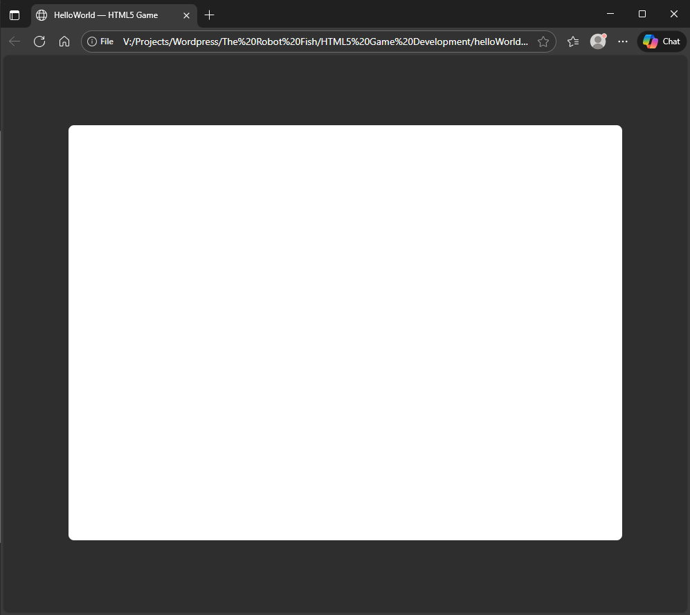
<!doctype html><html lang="en"><head> <meta charset="utf-8" /> <meta name="viewport" content="width=device-width,initial-scale=1" /> <title>HelloWorld — HTML5 Game</title> <style> /* Insert CSS Style here*/ </style></head><body> <div> <!-- Insert Top Controls Overlay Here--> </div> <div> <!-- Insert Game Canvas Here--> </div> <div> <!-- Insert Bottom Controls Overlay Here--> </div> <script src="https://code.createjs.com/1.0.0/createjs.min.js"></script> <script> /* Insert JavaScript Code Here*/ </script></body></html>In this template, we made comments where you would put CSS and JavaScript code. You can test it by opening this html file on your browser, but when you do, all you get is a blank page.
Adding CSS
To spice it up, we need to add some CSS code to differentiate between the background and our canvas. Add the CSS code below to the <style> tags in our template:
html,body{ height:100%; margin:0; touch-action: none !important;}body{ display:flex; align-items:center; justify-content:center; background:rgb(46, 46, 46)}#trf-gameCanvas{ width:100%; height:auto; border-radius:8px; background:white}This snippet of code will center all the items, make the background grey, and make the game canvas white. We will call the game canvas id="trf-gameCanvas", and it will fill the space with width: 100%; while maintaining the aspect ratio using height: auto;. All we need to do now is add the game canvas itself. Insert this code in the <div> tag for the game canvas:
<canvas id="trf-gameCanvas" width="800" height="600" ></canvas>Here is where we set the aspect ratio for the game. In this case, we have set the width="800" and the height="600" making the aspect ratio the classic 4:3. This ends up being a good compromise on PC and modern mobile screens because although 16:9 will fill up the screen more completely, it doesn’t work as well especially when the orientation of the screen is changed. The aim here is make the game canvas work on all devices, so this setting will do the trick.
Here’s what it looks like when you open the html file!
Vertical Scaling Problem
At its current state, the canvas is already responsive to changes in width of the screen, but you may have noticed it having problems scaling vertically. This is a problem on mobile devices where the user may try to do a landscape rotation, which will mess it all up.
We can solve this problem by creating a media rule in the CSS:
@media (max-height: 600px) and (aspect-ratio > 4/3) { #trf-gameCanvas{ height:75vh; width:auto; }}Now when you open the html file, the canvas will scale both horizontally and vertically to the size of the window. The height:75vh; is important here because on mobile devices certain UI elements can cover up the canvas. Having the height only be 75% of the viewing height solves that problem.
Drawing a circle
Finaly, let’s finish off our Hello World program by drawing a blue circle with the CreateJS library. Using this library is quite simple, we begin by copying the code below and paste it under the JavaScript <script>.
var stage,circle;function init() { stage = new createjs.Stage("trf-gameCanvas"); circle = new createjs.Shape(); circle.graphics.beginFill("DeepSkyBlue").drawCircle(0, 0, 50); circle.x = 400; circle.y = 300; stage.addChild(circle); stage.update(); window.removeEventListener("load", init);}window.addEventListener("load", init);What we’re doing here is we created a shape called circle, use the graphics inside it to draw the blue circle, and then positioned it at the center of the game canvas coordinates. We then added the circle to the stage, which is the game canvas that we created earlier, and we used the stage.update() function to draw all elements on that stage. The init() function is created to run after the page is loaded.
Hello World!
We’ve done it. In this part, we created a responsive game canvas that we can view on any device, and as the artists that we are, we drew a perfect blue circle. Where things go from here is up to you, the possibilities are literally endless. In the next part, we will add some controls to manipulate our blue circle.

To host this helloWorld.html file, all we have to do is upload it to the WordPress media library. We’ve done it, and you can see it in action here.
You can download all the files here.
Leave a Reply